By Amanda Sackawicz
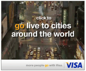
The topic of my posting changed drastically this morning as I went to check the weather and  encountered the banner below. There was nothing over-the-top about it – no fancy animation or flashing text – just a series of static images naming cities around the world with simple, straightforward copy placed just above the fold.
So why did this no-frills banner grab my attention? Quite simply – it was curiosity and the allure of what would happen when I did click on the image. I must say I was pleasantly surprised by what followed. Upon clicking, the banner switched to a live feed from high above the streets of New York City – there wasn’t an offer, a phone number or a catchy call-to-action. Visa wasn’t trying to sell me anything; instead they offered me another view of the world at 5:35am EST and, for a moment, they let me escape to a place the sun was already shining.

So why is Visa doing this? And why is the word “go” emphasized? As it turns out, this inventive little banner is part of Visa’s first global marketing campaign, entitled “More people go with Visa.” The campaign debuted globally on March 2nd and has been grabbing attention with both traditional and online advertising. Creative executions focus on the concept of “going” and making the most out of everyday life; and while Visa products are highlighted, there is no mention of spending more or being extravagant. Rather than focusing on the sell and trying to get more card members, Visa has taken an interesting position of suggesting that current card holders simply use the card more in their everyday life.
This notion has also been carried through to a microsite – http://go.visa.com. Upon entering the site, you are immediately engaged by elements entering from off screen to form the word “go.” Once the page has loaded, you are invited to click around and explore; in doing so, you learn that the elements on the page range from fun facts from around the globe to pictures that have been submitted by users via a partnership with flickr.

As you go through the site, each section requires a different form of interaction from the user; this not only engages the user but also re-enforces the spirit of the campaign. The “go explore” section provides ideas for activities and getting out an about with links to helpful sites. A wide range of categories are provided and users are invited to submit their own ideas. In the “go save” section, merchants discounts are provided to help the user save on everyday life. It is only is this section that the user will encounter mention of Visa products since the merchant discounts are dependent on their use; however, this is not done through a flashing banner asking you to “sign up now” or anything of the like, just body copy and a logo.
But will this get Visa the results their looking for? They have a strong start and a concept full of possibilities, but in the end it’s up to the consumers to buy into the idea. So watch a commercial, play with the site and see if Visa makes you want to “go.”


0 Responses to “Where would you go?”